QS Supplies
Call UsCall Us

Call Us: 0116 251 0051Call us today until 5:00pm

Colour of The Year 2017 - By 100 Best Interior Designers!!!

The season began with a good deal of anticipation about the Colour that will wear the crown this year and adorn our homes and interiors. Pantone has already announced Greenery 15-0343, a refreshing new shade, symbolic of new beginnings as their choice. Dulux declared Denim Drift, a timeless and versatile grey-blue tint, as their Numero Uno choice. Sherwin Williams went with the timeless, classic Poised Taupe, while Shadow—a rich, royal amethyst was Benjamin Moore’s selection and Farrow & Ball named Peignoir, a dreamy, hazy grey-pink, as their favorite hue this year. We conducted our own independent online survey where we sought the opinion of world renowned designers about the Color of the Year, 2017. We received varying views from designers who sent in their favourites as well as their individual predictions for this year. The survey covered about 350 Design experts worldwide, and we were overwhelmed by the spontaneous replies we received that helped us put together this brilliant piece and convey their predictions to a wider audience. ** Update ** Check Our Colour of the Year 2018 article, to know more about trending Colours in Interiors in 2018

Highlighted here are their views purely in order of the emails received from the experts!!
Meredith Heron

Meredith Heron

Meredith Heron Design | www.meredithheron.com

“At Meredith Heron Design we’ve been using Navy as a staple for about a decade. It’s our favourite neutral, and now the world has seemed to have caught on to it. Of course, in our desire to stay ahead of the game, we’re morphing navy as our staple colour into what we call either a rich Tourmaline or a Mallard Green. Not quite dark green, not quite navy, but the perfect landing spot between the two. We are currently using it in a high gloss lacquer for a kitchen we are designing in a historical home in Toronto’s, The Annex neighbourhood”.

“It’s Pantone 546U for me. Like Navy, everyone looks good in it, and it plays so well with other shades. We have it paired with golds and champagnes in another project. Super luxurious and deeply satisfying”!

  • Pantone 546U
    #465058
Mary Douglas Drysdale

Mary Douglas Drysdale

Drysdale Inc. | www.marydouglasdrysdale.com

“I certainly think that neutrals have had their moment, and it has been ushered in, as a welcome choice. With minimalism on the wane and maximalist on the rise, the richness of colour, for all interior surfaces, is appropriate. I think that we are ready for blue again. My choice for the Blue of 2017 is Pantone 18 3932 - TPG named Marlin. This shade is an unexpected Blue, with a dollop of Purple; it creates an effect of both comfort and romance. At once is familiar and fresh. Also, its a lovely colour to use in both modern and traditional interiors. Feeling the blue this year”! 

  • Pantone
    18-3932 TPG
    #5b6386

Patti Johnson

Patti Johnson

Patti Johnson Interiors | www.pattijohnsoninteriors.com

“I predict much more blues for 2017. Although the Colour of the Year for Pantone is Greenery, I feel it won't catch on in a big way. Even though the industry has seen a fair amount of blues over the past 2-3 years, consumers are now embracing vibrant blues”!
My pick is Pantone 295 XGC GRAPHIC COLOR
For Interior Design: PANTONE 19-4033 TCX POSEIDON!!

  • Pantone
    295 XGC
    #0a2a50
  • Pantone
    19-4033 TCX
    #123955
Alison Green

Alison Green

Twist Interiors | www.twist-interiors.co.uk

“From an exotic orange to a bright green to a timeless neutral, let yourself be inspired by rich, wonderful hues selected by Pantone that will uplift any project, whether you want to go bold, or simply add an accent colour”. My favourites for 2017 are: Pantone 18-0107 Kale and Pantone 19-4045 Lapis Blue

  • Pantone
    18-0107
    #5a7247
  • Pantone
    19-4045
    #004b8d

Amanda Gates

Amanda Gates

Gates Interior Design | www.gatesinteriordesign.com

“Green will be the biggest trend in the next two years. As our lives get more hectic and stressful, many of us will start looking to our spaces for serenity. My top pick of the moment for 2017 is Sherwin Williams SW4072 Cedar Green. This is an extremely healing colour. As an integrative, holistic Feng Shui practitioner, I know that this is also a great Feng Shui colour to heal a home”!

  • Cedar Green
    SW4072
    #1e382b
Kerrie Kelly

Kerrie Kelly

Kerrie Kelly Design Lab | www.kerriekelly.com

“We’ve always said that navy blue is the colour of the decade. We see shades of Pantone’s Navy Blue (19-3832) splashed on walls as a bold accent colour, on upholstered pieces like chairs and sofas to make a statement, and weaved into area rugs to anchor any room in bright and beautiful colour”.

  • Pantone
    19-3832
    #403F6F

Kim Johnson

Kim Johnson

Desire to Inspire | www.desiretoinspire.net

“We'd go with a Deep Forest Green – 5535.”

  • Pantone
    5535
    #183028
Julia Buckingham

Julia Buckingham

Viola! PR and Design LLC | www.violapranddesign.com

Blush Pink is the ultimate glamour color for 2017. Its soft and fresh and fun at the same time~ very Modernique! And juxtaposed with warm neutral like gray and sand it’s perfect for any room in the home; but especially a dressing room. Who doesn’t look better in the mirror when surround by this shade?!

  • Pantone
    7520 C
    #EABEB0

Elisabetta Rizzato

Elisabetta Rizzato

ER INTERIOR DESIGN | www.italianbark.com

“I can say that it will be a green but not greenery but Pantone Kale - 180107, I'm sure also dusty pinks will be very popular, it can be Pantone 14-1316”.

  • Pantone
    18-0107
    #5A7247
  • Pantone
    14-1316
    #DEAA9B
Ross Cassidy

Ross Cassidy

www.rosscassidy.com

“Farrow & Ball Ammonite 274 is the colour. It’s not Grey, and it’s not Taupe, it’s the perfect blend of both. Grey is too cold, and Taupe is too boring. Their hybrid is perfect”!!

  • Ammonite 274
    #e4e1d2

Dean Keyworth

Dean Keyworth

Armstrong Keyworth Ltd | www.armstrong-keyworth.co.uk

“I think Turquoise (RAL 6033) will be big in 2017. Cool enough to work as a dramatic background on walls, but also perfect a sophisticated accent colour in a more neutral scheme”.

  • Mint Turquoise
    RAL 6033
    #579e8c
Kate St. James

Kate St. James

The Design Works | www.katestjames.com.au

“My pick for 2017 is Pantone Biscay Bay 18-4726 - a beautiful greenish blue that works with our wonderful Australian land and seascapes, a true favourite of mine”!

  • Pantone
    18-4726
    #097988

Sam King

Sam King

Lime Lace | www.limelace.co.uk

“Here at Lime Lace we are focusing on all shades of green in 2017; not only is green calming and sophisticated, but it also adds a botanical look to our homes which is another big trend in interiors for 2017! Pantone has recently released a fresh & zesty bright green called Greenery 15-0343. For something more calming I would also recommend 18-0107 Kale which is a neutral foliage-based green. Go bold and create a statement green wall in your home or just introduce green through the use of plants, cushions and textiles”.

  • Pantone
    18-0107
    #5A7247
Carrie Oesmann

Carrie Oesmann

Bailiwick Interior Design | www.bailiwickdesign.com

“As an interior designer, with a wide client base, I feel that Royal Blue will be in trend of 2017!  Clients are looking for a more sophisticated palette, but one that works well with their existing pops of colour and previous accent colour selections. Royal Blue offers the solution for easy blending and stands on its own, as well! Although there are several options in this range, Pantone 281 is a good place to start”.

  • Pantone 281
    #00205B

Judith Harrop

Judith Harrop

Judith Harrop | www.judithharrop-interiordesign.co.uk

“Pantone colour of the year PANTONE 15-0343 may look lovely and fresh on their promo video, but I can categorically state that it won't be finding its way into my design schemes. We will be working primarily with Inky Dark Blues and Deep Teals with Rust and Orange accents. I don't care for Rose Gold but the warmer metals, brass, antiqued brass and bronzes are being introduced heavily into our schemes. I think pinning things down to one shade is always difficult though’ different trends are pointing at different colour palettes; tribal is big, works with mustardy yellows and earth tones, industrial is still a big trend according to our trip to Maison et Object. So dirty greys, reds and dark blues still here...At high luxury end of black and gold was very apparent”. Pantone reference: 5463, 5473, 125

  • Pantone 5463
    #07272D
  • Pantone 5473
    #115E67
  • Pantone 125
    #B58500
Denise Smith

Denise Smith

Denise Smith Designs | www.denisesmithdesigns.com

“Grey is that I've used numerous times over the years. It's always an easy option and always neutral regardless of which shade of Grey you use. Designers are tiring of it at this stage, but it's always essential to have a ‘go to’ neutral shades that can be applied to most homes. I'm favouring at the moment Farrow and Ball Skimming Stone 341. The shade I've been using off late is Navy Blue. It's the most amazing colour and again neutral. I use it as a backdrop for my client’s artwork, mirrors and furniture. It's a classic colour. It doesn't overpower a room it simply enhances the furniture and objects that are already there. Try Hague 30 from Farrow and Ball”.

  • Skimming Stone
    341
    #e9e2d0
  • Hague 30
    #3E4E56


Felice le Dragon

Félicie le Dragon

Félicie le Dragon | www.felicie-le-dragon.com

“My shade for 2017 is Dark Sapphire. I always loved dark shades because they magnify the surroundings: colours, materials, items... You can mix and match everything you want when you have a deep colour like Dark Sapphire. Under the sunlight, you will see the blue reflects, deep like the soul. Just add Silver, Gold, Copper, a glimpse of warm White or Mustard Yellow, and that's it! You have a luxury Parisian spirit”.

  • Pantone
    19-4020
    #353846
Denise Mc Gaha

Denise McGaha

Denise McGaha Interiors | www.denisemcgaha.com

“I believe the shade that will rule in interior design is a Plummy or Burgundy. This goes beautifully with the grey palettes we have seen the past five years, but offers a richer, more dignified companion than the bright yellows and oranges of the past”. Benjamin Moore–Radicchio-CC-32

  • Radicchio
    CC-32
    #6a3642


Martyn White

Martyn White

Martyn White Designs | www.martynwhitedesigns.com

“We all know that green is going to be big for 2017, but I think it is the darker shades that will prove to be the most popular. People are becoming more daring, using darker and richer colours to decorate with. I think a shade such as PANTONE P 131-15 U has what it takes to be a popular colour for the year, it has a warmth and richness without being too overpowering and can look fantastic in almost any room”.

  • Pantone
    P 131-15 U
    #2E7063
Stefania Skrabak

Stefania Skrabak

Art • Home • Garden, LLC | www.arthomegarden.com

“I believe we are going to continue with warm light dusty tones--whether they are a mauve, green, taupe, pink or tan. If I had to pick one, I would say warm Taupe Beige for interiors just taking the edge off the stark white trend”. PANTONE P 1-9 C

  • Pantone
    P 1-9 C
    #F6F4EA


Carlotta Berta

Carlotta Berta

unprogetto | www.unprogetto.com

“I think that the colour which will dominate in interiors in 2017 will be PANTONE 13-1404 Pale Dogwood.”

  • Pantone
    13-1404
    #EDCDC2
Sharon C Pett

Sharon C Pett

Pett & Associates, LLC | www.pettandassociates.com

“Reflecting current mood: Benjamin Moore Shadow 2117-30.”

  • Shadow 2117-30
    #524b59


Julia Mack

Julia Mack

Julia Mack Design | www.juliamackdesign.com

“I have found that a saturated Teal Blue is the perfect counterpoint to the very popular grey/taupe and black trends of recent interior design directions. Taking a page from the apparel industry, teal blue speaks to soft peach, pale green and baby blue by grounding these pastels and brightening up sombre greys, taupes and black. It’s not too feminine or girly and is the perfect counterpoint to warm wood tones from a natural ash to a dark walnut”. This is my selection: Pantone 308 U
  • Pantone
    380 U
    #266782
Athina Bluff

Athina Bluff

Topology Interiors | www.topologylondon.co.uk

“My choice would be PANTONE 17-4123 aka NIAGARA. It’s a rich, deep hue of a Teal Esq colour. With the influence of people like Abigail Ahern, interiors are slowly erring away from the standard white, and we are getting bolder with our designs. Now people flock towards darker shades which add depth and cosiness. I expect to see this shade a lot throughout 2017, and not just because it’s the colour on my walls!”

  • Pantone
    17-4123
    #5487A4


Loria Denis

Lori Dennis

Lori Dennis | www.loridennis.com

“Blue has officially made its mark as a neutral in 2017, and we couldn't be more pleased.  It goes with everything!  We've been seeing Indigo Blue for a couple of years now, and it's definitely here to stay.  Blue Denim is also making a strong comeback to create a more laid-back feel to a space.  Our favourite colour combinations that go well with blue are Seafoam, Cream, touches of Black, Heather Grey and Emerald or Malachite Green. Throw in a pop of fuschia and you're set!”
Anna Crott

Anna Crott

AJD Interiors | www.ajdinteriors.com.au

“I have been saying now for a while, that Green is the new Black. A client, who was re-doing her bathroom later part of 2016, asked me what was the latest colour trend, to which I replied that you’ll see more and more of Green. Her response was, “then I can keep my bathroom as is (with a giggle)” as it was an original 1960’s green.”

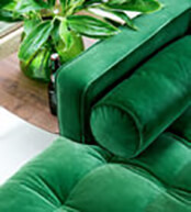
“Even indoor plants are used more again (like in the 70’s 80’s), green velvet sofas or armchairs look stunning. Pantone’s predictions are on my wavelength (Pantone 18-107 Kale) also Orange (Pantone 17-1462 Flame) I love, which is red based and the other shade which is a favourite is a Blue, Pantone 17-4123 Niagara, which I used in a Project called Coastal Elegance, late last year.”

  • Pantone
    18-0107
    #5A7247
  • Pantone
    17-1462
    #F2552C
  • Pantone
    17-4123
    #5487A4


Eileen Johnston

Eileen Johnston

Eileen Johnston Interiors | www.ejinteriors.co.uk

“I am seeing much more colour now being asked of me, and the new design fabric books that I am being shown by representatives of fabric companies, are showing bold new shades, from Orange, Bright yellows, bold flower fabrics with lots of shades within them.  Romo’s Black edition has just brought out a fabulous new book by the name of Kaleido, where you can see the use of colour is brought in, in very complementary ways.  My clients are still going with greys, but are mixing the grey with some of the bolder shades; I like the following Pantone shades. 13-0755 17-1463 and 172034.”

  • Pantone
    13-0755
    #F6D155
  • Pantone
    17-1463
    #DD4124
  • Pantone
    17-2034
    #CE3175
Kiran S H

Kiran S H

Kredenza interior studios | www.kredenza.in

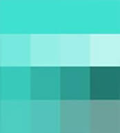
“My choice for the year 2017 will be Cyan/Turquoise and shades of the same. I name these shades of cyan/turquoise as "the colour of nature". Cyan is an out of the box colour. When it is used for all styles of interiors such as classical, rustic or even modern, proves to be aesthetically outstanding colour, making interiors look fresh, subtle and very attractive. Even when this shade is used for finishing off any furniture, looks rich and one cannot take their eyes off it! A tint of cyan shade makes interiors look flamboyant and stylish as it is a reflection of nature. So definitely this shade will dominate 2017”!

  • Cyan / Turquoise
    #42dfce


Jason Bonham

Jason Bonham

Bonham Interior | www.bonhaminterior.com

"We have recently been doing a mix of soft greys, mid green greys and darker greens into the teal tones. Pantone 309U. This would best represent some of the work we have been doing in the high end residential market. We find the use of the darker tones in our spaces create a feeling of luxury, depth and layering with a variety of more reflective finishes and surfaces, such as chrome, brass, glass which in turn lighten and bounce the colour around the spaces . Modern Art, custom furniture, rich textured fabrics, velvets and wovens also add to the decadent and personalised environments so many of our clients are seeking."

  • Pantone
    309 U
    #3F5864
Anna Crott

Amy Kalikow

Amy Kalikow Design | www.amykalikowdesign.com

“We love moody colours for 2017, whether they are blues, greys or plums, the deeper and moodier the better. Deep shades are rich and bring about a warm feeling to any room. Take a chance and be bold this season!” 275C, Pantone 19-3830 TCX, 2380CP

  • Pantone
    275 C
    #201747
  • Pantone
    19-3830 TCX
    #363151
  • Pantone
    2380 CP
    #313546


Kate Martin

Kate Martin

Rethink Interiors | www.rethinkinteriors.co.uk

Kate Martin of Rethink Interiors Ltd believes “It is not so much a single colour that will reign in 2017, but more tones that are strong and sophisticated – those that embrace outgoing personalities and make a bold statement! One colour we are seeing coming through in a lot of our Supplier palettes is PANTONE 18-6330 TPX Juniper and a darker, richer green PANTONE 19-5408 TCX Bistro Green. 2017 will continue to embrace the maximalist look!”

  • Pantone
    18-6330 TPX
    #3F7045
  • Pantone
    19-5408 TCX
    #395551
Oberoi

Oberoi

Office Equipment

“As we are primarily an office fit out company, our prediction may differ with Residential purpose. Since 1975, I predict that the wall will be painted in Pantone shade 420, and false ceiling in Pantone shade 413. One or two walls can be painted in a solid colour for better effect”.

  • Pantone
    420
    #C7C9C7
  • Pantone
    413
    #BABBB1


Liam Mooney

Liam Mooney

Liam Mooney Studio | www.liammooney.co.za

I'd say shades of Greige

  • Pantone
    16-1109 TCX
    #928475
Angela Steyn

Angela Steyn

Angela Steyn & Co. | www.angelasteyn.com.au

“We run our business from the Northern Beaches of Sydney, so fresh coastal shades are always big for us. This year we predict Pantone Island Paradise will be popular with our clients”.

  • Pantone
    14-4620 TCX
    #95DEE3


Kimberley Richmond

Kimberley Richmond

Beautiful Spaces | www.beautifulspaces.co.za

“My all-time favourite right now is Blue. I know it has been around from last year, but the variation is a more toned down version of it. It is almost a grey/dirty blue which is stunning and very classy. The reference for this shade is Midas YSTR-06203 and its called Scaffold plank, and is great for feature walls and creating a "wow" effect in a room. That along with greys and lime green will definitely be my go-to colours for 2017”.

  • Pantone
    16-5917
    #709A89
Nisrine EL Lababidi

Nisrine EL Lababidi

Harf Noon Design Studio | www.harfnoondesignstudio.com

“So in my opinion, although Pantone's Greenery 15-0343 has been named colour of the year, I feel that a more toned down version of that like Pantone 18-0119 Willow Bough is a bit more sophisticated when applied on interiors and especially in a matte finish on walls. It's trans-seasonal and easily complements any colour”.

  • Pantone
    18-0119
    #59754D


. Charlene Schumacher

Charlene Schumacher

Fresco Interiors design group Inc. | www.frescointeriors.ca

“We feel the bold Deep Blue - Pantone 2738 XGC -will be widely embraced for its luscious, rich colour. It feels refreshingly modern with its strong, brilliant colour, yet luxurious when applied to textural fabrics such as velvets and faux furs. We love the way it complements polished gold accents!”

  • Pantone
    2738 XGC
    #28098D
Nora Dieppe

Nora Dieppe

Dieppe Design | www.dieppedesign.com

“After researching the recent fashion runways and reading many other home blog predictions, I have selected PANTONE 11-2409 TCX Delicacy, which I believe will harmonise well with soulful greens, sleek greys and metallics, all set to be a hit for this 2017 too.”

  • Pantone
    11-2409 TCX
    #F5E3E2


Arjan Nijen Twilhaar

Arjan Nijen Twilhaar

Aiden T | www.aiden-t.com

“Its very hard to pinpoint to only one colour, but in all my proposals for upcoming year, I see myself putting in a lot of teal or peacock blue hues. And that is mostly for accent colours for a side chair, artwork and other soft furnishings. The overall trend for me is going with slightly warmer tones – with neutral beige on the walls and deeper wood colours on the floor. So, if I have to pare it down to a Pantone shade, it would be 3145U. It is a shade that can match a wide range of other hues and is timeless as well.”

  • Pantone
    3145 U
    #007788
Ruben Rossouw

Ruben Rossouw

Block Plan Architecture and Interior Design | www.blockplan.co.za

“I’m looking forward to seeing the very popular pastels that we’ve had this past year evolve into more interesting shades. I’ll be using lots of greens, and my choice for 2017 is 50JJ 23085. It’s a quiet colour that fascinates me. It’s the shade you see when poplar or blue gum leaves catch the sunlight. I would name it Poplar.”

  • Dulux
    50GG 23/085
    #728681


Anna-Carin McNamara

Anna-Carin McNamara

ANNA CARIN design | www.annacarindesign.com.au

“I think lots of brown like Farrow & Balls Salon Drab no 290 and Mahogany 36.”

  • Salon Drab
    290
    #675D53
  • Mahogany
    36
    #41363A
Eily Roe

Eily Roe

Eily Roe Interiors | www.eilyroeinteriors.ie

“Forget 50 shades of anything, its 40 shades of green this year. But in Ireland, we are hesitant about using it in our homes, as a lot of verdant greens are ubiquitous in our land and culture, and our eyes have grown weary of them. Bring on Pantone 5467 a deep green which creates a cloak of invisibility when used externally and is a beautiful backdrop to rose gold and brass in interiors, evoking stately homes and Irish wolfhounds by a roaring fire”.

  • Pantone
    5467
    #18332F


Fabiola Avelino

Fabiola Avelino

FABIOLA AVELINO INTERIORS | www.fabiolaavelino.com

“The hottest colour trend in 2017 is Pantone 364 C. Emerald green is coming in super-hot!”

  • Pantone
    364 C
    #18332F
Joe Human

Joe Human

Designs By Human | www.dbhuman.com

“We have chosen Pantone 17-4123 TPX Niagara as a colour that will dominate 2017. Various shades of Blue are already becoming popular, and I think calming shades such as Niagara will be used as spaces become subtly bolder, getting out of the grey and neutral phase. We expect it to be used through wall as well as smaller accents”.

  • Pantone
    17-4123 TPX
    #578CA9


Ellen Kennon

Ellen Kennon

Ellen Kennon | www.EllenKennon.com

“I'm finding that Complex Neutrals are still the most popular shades with both my decorating and paint clients. Complex neutrals are what I call "no colour colours". They are more like misty, atmospheric backdrops that are so subtle and chameleon-like that you find yourself constantly trying to figure out exactly what shade it is! Examples are Pumice, Mushroom, Gustavian Grey, Merlin's Mist, Avalon Mist, full spectrum paints that have many pigments and because of the number of pigments, they pull together a variety of furnishings.”

Kiran Singh

Kiran Singh

Studio Kiran Singh | www.kiransingh.co.uk

“As I am a lover of pink, I think Pantone’s ‘Diva Pink’ – Pantone Smart 16-165OTN would be lovely to see.”

  • Pantone
    16-1650 T
    #FF1659


Alena Chikurnikova

Alena Chikurnikova

AlenaC Design | www.alenacdesign.com

“Seeing what people like and choose for their homes, there is one shade which is on a high request. Unfortunately, I don't work with Pantone, but in Dulux, it is Denim Drift. This shade became favourite for many people. Also, I can say that rich tones of grey, teal, chocolate brown, leafy green and mustard show a good perspective to be seen in many interiors during 2017. I like to see that people slowly start to use more rich paint tones and become braver on choosing unpredictable colours for the feature and accent walls.”

  • Denim Drift
    #7C8D95
Tina Dyba

Tina Dyba

Diva Interior Concepts | www.divainteriorconcepts.com

“2017 Color Trends in Fashion and Home Décor will be an assortment of Blues – especially Navy Blue.” Pantone:  19-3964    Monaco Blue and Pantone:  19-4030   True Navy, coordinating with Pantone 12-0000 White Swan and 13-0002 White Sand. Upholstery, case goods, decorative accessories are using these shades to blend with the Classic and Rustic Contemporary trends.”

  • Pantone
    19-3964
    #274374
  • Pantone
    19-4030
    #3F5277
  • Pantone
    12-0000
    #E4D7C5
  • Pantone
    13-0002
    #DBD5D1


Peggy

Peggy Scinta

Scinta Designs | www.scintadesigns.com

“I love to see pink used as a neutral, with traditional design, modern or even mid-century modern design. Pink and derivatives of the colour can be sophisticated and serious as well as playful depending on the application.  Pink tends to be a happy shade, and we are inspired by happy expectations for 2017.   My personal favourite would be Fairy Tale Pink/13-2802”.

  • Pantone
    13-2802
    #F2C1D1
Audrey Margarite

Audrey Margarite

Bunny Williams Home | www.bunnywilliamshome.com

“After years of jewel tones like emerald green and orchid purple dominating design, I think people are in need of a breath of fresh air. Pantone 12-5203 TPX, Murmur, has interest but is not overpowering. Its slight blue/grey cast is more dynamic than white. But, Murmur has the same calming effect as a soft white.”

  • Pantone
    12-5203 TPX
    #D4DED9


Salissa Busatto

Salissa Busatto

Salissa Busatto | www.salissabusatto.com

“Selected: Dark Blue - PANTONE 19-4035”
“I believe this is the 'blue year'! As an Interior Designer, I can see the strong tendency of shades of blue in interiors in 2017. I have selected the soft and sophisticated Dark Blue colour 19-4035, which I believe is a perfect match with luxurious designs. The shade goes softly and perfectly with the trend brass and copper furniture. Create a mix of blue in your house and play around with loads of colour combinations”.

  • Pantone
    19-4035
    #305679
Nicola Manning

Nicola Manning

Nicola Manning Design | www.nicolamanningdesign.co.nz

“I have chosen a gorgeous green/blue colour called Peabody from Dulux NZ. I love the beautiful blues which are so current at the moment, but complementing these in 2017 will be rich shades of green and more blurring of the lines between blue and green. Colours of this depth are made to be put together with the brass, copper and gold lighting and accessories that are so on trend.”

  • Dulux
    P30B6 Peabody
    #3F7274


Natasha Sanchez

Natasha Sanchez

Featured Interiors, LLC | www.featuredinteriors.com

“Many of my clients have been requesting blues, navy specifically. One colour I have used frequently is from Sherwin Williams, SW6244 Naval. And bronze metals are very close behind. I project that dark blues will be dominant in 2017.”

  • Naval
    SW 6244
    #2F3D4C
Chaz Reid

Chaz Reid

L'adorabelle Interiors | www.ladorabelle.com

“I foresee heaps of exciting changes happening in 2017 in regards to colour trends. I focus specifically on nursery designs and have just written a blog on this. My predictions for 2017 are Olive Green, Mustard and Teal. Seriously yummy shades!”

  • Pantone
    15-0522
    #B5AD88
  • Pantone
    14-0952
    #D8AE47
  • Pantone
    17-4919
    #478589


Sapna Aggarwal

Sapna Aggarwal

ANSA INTERIOR DESIGNERS | www.ansainteriors.com

"The colour trending this year is the Pantone Greenish. With the city life increasing and the siemens of greenery decreasing, this year this seems the concept would be to get outside inside and add some freshness to the dull and boring city life. The Pantone code is Greenery 15-0343."

  • Pantone
    15-0343
    #88B04B
Allison Jaffe

Allison Jaffe

Allison Jaffe Interior Design | www.allisonjaffe.com

“I'm going with a green peacock blue”.

  • Green
    Peacock Blue
    #008381


Joanne Kelly

Joanne Kelly

Think Contemporary | www.thinkcontemporary.ie

“The shade that we think will dominate interiors this year is Dusky Pink, Pantone 509C”.

  • Pantone
    509 C
    #E8B3C3
Clare Morton

Clare Morton

Studio Morton | www.studiomorton.com

“It won't dominate initially, but I think we will see Purple coming through in interiors towards the end of 2017. A Pantone suggestion 266C.”

  • Pantone
    266 C

    #753BBD


Zahra

Zahra Ahmed

Studio Red Interiors | www.studioredinteriors.org

“I really think Dark Purple would be the Shade of the Year!”

  • Pantone
    19-2524
    #582147
Vickie Nickolls

Vickie Nickolls

Victoria Nickolls Ltd | www.interiortherapy.co.uk

“I predict that all shades of Green will be a massive colour trend for 2017, from Forest Greens to Teals—the whole spectrum. Teamed with Brass accents and also pops of Pink or Mustard Yellow for a luxe feel, with textures such as velvets or simple muted Green and Greys for a more calming natural feel, teamed with linens. I myself can’t wait to use Green in future projects this year”. A favourite is Pantone 18-5611 TCX Dark Forest

  • Pantone
    18-5611 TCX
    #556962


Lurleen Kirkwood

Lurleen Kirkwood

I For Style | www.iforstyle.com.au

“A resurgence of strong, jewel-like colours will be big in 2017, quite possibly as a counter balance the predominantly white Scandinavian interiors we still see so much of. Warm, nurturing Dulux Rich Red Violet P46H9, is one such shade that I believe will feature strongly.”

  • Dulux
    P46H9
    #7C3653
Ioanna Lennox

Ioanna Lennox

IOANNA LENNOX INTERIORS | www.ioannalennox.com

“We have taken our cues from Greenery, the Pantone Colour of 2017, and chosen a moodier, darker shade of green in Silver Pine (Pantone 18-5410 TCX) – it’s less bright and more sophisticated and although fairly dark, it’s calming enough to have in a bedroom, living room or even a study. Nude tones are also becoming more commonplace used as a neutral base rather than the traditional warm whites or greys, and are ideal in master bedrooms, children’s rooms or even a bathroom. We love Pantone 7513 C in particular because of its softness and warm undertones on which you can layer a multitude of colours.”
  • Pantone
    7513 C
    #E1B7A7
  • Pantone
    18-5410 TCX
    #4E6866


Irene Fister

Irene Fister

Fister Design, Inc. | www.fisterdesign.com

“With the continuing trend of using whites and grey, I also think hues of purple will be used again. I just specified the #2118-50 from Benjamin Moore for one of my client's bedrooms, and we both love this shade. My other favourite neutral shade that I tend to use a lot is Distant Gray BM OC-68.”

  • Excalibur Gray
    2118-50
    #AAACB7
  • Distant Gray
    OC-68
    #F3F5F2
Monica Teder

Monica Teder

Comelite Architecture & Structure | www.comelite-arch.com

“I feel like next year's going to be the breakout year for the colour. Because of its inherently neutral traits, Greenery can be used in large or small doses, with or without other neutrals, and as an accent or a foundation for other colour schemes. Greenery has had a fascinating history, and combination of greenery with neutral shades brings a nature feel to your house.”

  • Grey
    #B7B8BA
  • Green
    #A8B762


Yasmin Chopin

Yasmin Chopin

YASMIN CHOPIN INTERIOR DESIGN | www.yasminchopin.com

“My clients have wide-ranging tastes when it comes to colour, but I see a return to warmer neutrals such as PANTONE 15-1040 TCX, Iced Coffee. It’s bolder than beige and easy to mix with more vibrant hues. It makes a super backdrop to copper, gold and silver, infact any of the metallics shine against this luscious colour. In our UK climate, we need a bit of comfort, and I’m not surprised this cosy, laid back hue is becoming a popular addition to a wider palette of colours for the home.”

  • Pantone
    15-1040 TPG
    #B69573
Aarti Popat

Aarti Popat

Aarti Popat Interior Design | www.aartipopat.co.uk

"Colour is a very important part of our homes and our lives, it affects our moods and our sense of well being. Furniture; whether its a new chair or an old chair that has been re-covered with wacky fabric has a story. It’s an integral part of your home that tells the story of the people who live there, which is what every house should do. Colours, furniture and our belongings work together to create a sense of harmony or chaos, whichever you choose in that moment. The colours trends that 2017 will bring include warmer hues of the Scandinavian greys that dominated 2016, I love Urban Haze by Valspar, accents of pink or blush as it is now referred to as and the ever faithful gold and copper which has now become Rose Gold. I know that the Pantone colour of the year 2017 is Greenery but i think most people are possibly thinking about a slightly romantic and warmer palette and Dulux colour of the year 2017 is Denim Drift which i could see as upholstery but i don't think i could take over the whole room with it unless i was going for a big bold statement in a particular space. As with all trends, they come and they go, you will pick what you are drawn to and ignore what you aren’t, as i said; its the feeling that is evoked in you when you see that colour in your space, everyone is different and different feelings dictate your space, your personal space."

  • Urban Haze
    #B6B8B5
  • Rose Gold
    #b76e79


Aurora Aleson

Aurora Aleson

AURORA ALESON INTERIOR DESIGNER | www.auroraaleson.com

“It is a bit difficult to reply to your question as there are many surfaces where colour is applied, all with their special characteristics. The colour codes for commercial paints are worked on a percentage of colours. The residential ones are mixes of natural pigments like in a painting, so it is better to use the products of the manufacturers. To confuse even further some of the new shades are very difficult to find.” For Walls in residential houses, the new Farrow and Ball Peignoir and Grey with a touch of rose. For Wall in hotels and restaurants, RAL 26029 With accents in 12B55 and Furniture accents of Rose petal BS381C 447 Salmon Pink also called Make-up. For metals—Copper

  • Peignoir 286
    #CEBFBA
Erica Matthew

Erica Matthew

Funk Studio | www.funkstudio.co.nz

“Even though the Pantone colour of the year is Greenery, I think we will see a fair bit of muted tones that come from Nature - Such as Pantone Kale 18-0107, which I love! Alongside aesthetics like wood, wool, metal (brass, copper, stainless steel) this shade will thrive, and also looks great with black, white, cool blue tones and grape purple”.

  • Pantone
    18-0107
    #5A7247


Daniela Nuila

Daniela Nuila

Mint Décor Inc | www.mintdecormiami.com

“I believe we will see an influx of Purple next year. From a dark Amethyst to a light Orchid, Purple is a very versatile, elegant shade that never goes out of style. Based on the Pantone chart, I believe we will see lots of Pantone 7664C mixed with Emerald greens for timeless, bold designs”.

  • Pantone
    7664 C
    #653279
Priya Naik

Priya Naik

Interior Design Journey Pte Ltd | www.interiordesignjourney.com

“I think Pantone 15-0343 Greenery will be a key colour in 2017; we have already seen a lot of palm and tropical leaf prints in the market. The shades can be used to jazz up a room by creating a statement on a feature wall or through accents in accessorising and soft furnishings.”

  • Pantone
    15-0343
    #88B04B


Toni Sab

Toni Sab

Toni Sabatino Style | www.tonisabatinostyle.com

“I think that colour trends are leading in a sultry direction. Soft romantic matte metallic and warmth will dominate in the coming year. Light Taupe Pantone 16-1210 and Simply Taupe 16-0906 are fantastic paired with navy, dark grey and Greenery, the Colour of the Year. I see these mixed with metallic accent walls, particularly dusty matte gold and mixed metals such as burnished brass copper and iron for lighting and accents and creamy off-white or matte black mouldings. These tones blended with some natural woods evoke a mood of organic modernism that is both sultry and fresh and can blend with both minimalist and antique furnishings.”

  • Pantone
    16-1210
    #B19D8D
  • Pantone
    16-0906
    #AD9F93
Diego Correa

Diego Correa

www.diegocorreainteriordesign.com

“One of the most awaited announcements in the design industry is what shade Pantone chooses as the colour of the year. The honour went to the Green 15-0343. Pantone is not the only one who chooses a shade; painting companies have their favourites too:  Dulux with Denim Drift and Farrow and Ball with Peignoir are just two of them. Now, how this will influence the decisions taken by designers and home owners in their schemes is the question everybody asks and one I will try to anticipate: Green is a warm shade, so depending on the city where you live, it will be paired with colours that will emphasise or tame it. In London, I see it playing with greys and ochres, combinations that offer a beautiful balance. Aligned with grey, green can embrace a more contemporary look, whereas, with ochres like mustard or browns, it brings the feeling of nature and earthy comfort”.

  • Pantone
    15-0343
    #88B04B
  • Denim Drift
    #7C8D95
  • Peignoir
    286
    #CEBFBA


Julia Mironova

Julia Mironova

“As for me I''m sure it will be all shades of green and would vote for Canton (94) (Little Green), simply in love with it.”

  • Canton 94
    #236D6F
Tania Bell

Tania Bell

www.greenroominteriors.com.au

“I think that this year we are going to see a return to botanical and earthy greens, hues that evoke a sense of calm and homeliness. My pick is called Xena P17D7 by Dulux.”

  • Xena
    P17D7
    #847C54


Medina King

Medina King

MK Kids Interiors | www.mkkidsinteriors.com

“I think mustard will be popular in interiors this year.”

  • Pantone
    14-0951 TPX
    #E9A916
Deborah Garth

Deborah Garth

Deborah Garth Interior Design | www.deborahgarth.co.za

“I seriously believe a flesh colour is the trend for 2017. Look at dusty pinks as well, mixed with coppers and greys. Going by Pantone swatches: 16-1431 CANYON CLAY. 16-1717 PINK ICING. 14-1122 SHEEPSKIN. Mixed with 16-1325 COPPER. AND 16-1103 PURE CASHMERE”.

  • Pantone
    16-1431
    #CE8477
  • Pantone
    14-1122
    #DAB58F
  • Pantone
    16-1325
    #C47E5A
  • Pantone
    16-1103
    #ADA396


Jill Seidner

Jill Seidner

JILL SEIDNER INTERIOR DESIGN | www.jsinteriordes.blogspot.com

“My thoughts are while Greenery is Pantone's Colour of the year, and I happen to love shades of greens, I feel Greys are still dominating. I see lots of Grey & Greige in furnishings, most of my clients are gravitating towards the light woods and finishes. And the most popular shade I'm using in paint are the greys. Therefore, my vote would be for Pantone Drizzle 16-4402”.

  • Pantone
    16-4402
    #A09F9C
Elena Solodovnikova

Elena Solodovnikova

ML Décor LLC | www.ml-decor.com

“Pantone 15-0343 TPG Greenery and accents in Pantone 18-1659 TPG Goji berry.”

  • Pantone
    15-0343
    #88B04B
  • Pantone
    18-1659
    #B91228


Laura Keating

Laura Keating

Tinsley Interiors | www.tinsleyinteriors.com

“Our team of designers have all agreed that the below shade is going to be our most popular colour for 2017. We think this shade will be a warming, calming and versatile colour to follow and complement the grey trend and add a little lift to people's homes.” Pantone Ref: 2282 XGC

  • Pantone
    2282 XGC
    #BFDE8D
Samantha Mansell

Samantha Mansell

Chrysalis Interior Design | www.chrysalisinteriordesign.com

“My choice for of 2017 is Pantone Insignia Blue (19-4028 TPG). It is a greyed, slightly faded navy which is still big enough to pair with the bright shades which will also be popular this year and also will go well with plain white or metallics, especially copper or gold.”

  • Pantone
    19-4028 TPG
    #414C60


DDylan Olivier

Dylan Olivier

House of Gargoyle | www.houseofgargoyle.co.za

“Here is my colour trend forecast for 2017— It is important to state that these shades are not only directed at interior design but design in its entirety from fashion, make-up, interior design, etc. If one looks at Dubai, New York & Paris, the interior design aesthetic is a warm neutral palette, not the beige on beige type, but a palette that uses warm neutrals and soft metallics like rose gold and copper with textures and layers "clever clashing layers" is the way to go with hot colours, eye-popping Fuchsia Rose, Zingy yellow and tropical green.” “Metallics are making a comeback!!! With these, striking, vibrant shades as the dominating accents within the interiors”. The Pantone codes are: Pantone: Fuchsia Rose 17-2031TPX, Pantone: Zingy Yellow or Vibrant Yellow 13-0858TCX, Pantone: Tropical green 18-4930TCX

  • Pantone
    17-2031 TPX
    #C3447A
  • Pantone
    13-0858 TCX
    #FFDA29
  • Pantone
    18-4930 TCX
    #008786
Brandon A Smith

Brandon A Smith

DCOOPMEDIA | www.dcoopmedia.com

“Deep, saturated blues continue to make cameo appearances adorning the products of every industry–from automotive to appliances, cabinetry to clothing, and everything in between. More recently, blues with warmer undertones have shifted from supporting role to starring actress. Personal favourites include a library with floor to ceiling millwork lacquered in a warm blue by designer Meredith Heron and the pairing of a green-toned blue with pale pink for a recent client’s branding exercise.”

  • Blue
    #00487d


Monique Stein

Monique Stein

www.mdpropertystyling.co.uk

“Greenery Pantone 15-034 and Warm Grey”

  • Pantone
    15-0341
    #8DB051
Jennifer Woch

Jennifer Woch

House of J Interior Design | www.houseofjinteriors.com

"I would say we will see a lot of the shade mentioned below! Walls, cabinets, décor."

  • Pantone
    19-5413
    #335959


Tzara Shukri

Tzara Shukri

senihomes | http://tzara_shukri.houzz.com

“I find that this year we could see a continued use of cool Scandinavian and retro-contemporary trends in Kuala Lumpur. I often use JOTUN / Pantone in my works and find myself gravitating towards the following muted colours for 2017.”
Neutrals such as: 1145 BAND STONE, 10679 WASHED LINEN COOL colors such as : 5249 ARCTIC GREY, 7163 MINTY BREEZE, 8478 PALE GREEN and for a WARM touch : 10683 CASHMERE, 3331 URSULA

  • Band Stone
    1145
    #7F7971
  • Washed Linen
    10679
    #C9C3B6
  • Minty Breeze
    7163
    #ACB2A8
  • Cashmere
    10683
    #B19C80
Robyn Hawke

Robyn Hawke

Inspired Spaces | www.inspiredspaces.com.au

“My prediction is for smoky blues that give a sense of sophistication and luxury and are a perfect colour to complement other blues or contrast with whites to showcase architectural features.” Dulux Signature PG2G6

  • Dulux Signature
    PG2G6
    #545E67


Kathry Marsh

Kathryn Marsh

Kathryn Interiors | www.kathryninteriors.com

“Blue will continue to command our attention in 2017, particularly on trend is the Pantone Poseidon 19-4033 a deep inky blue that exudes a sense of mystery and contemplative introspection. A sophisticated and multifarious shade, Poseidon adds depth to a room and is the perfect backdrop for layering other colours. The overall feel will depend on the colours it is combined with. It is classic and timeless when paired with other blues and whites. With bold and saturated shades such as bright red, yellow and teal, it creates an energising atmosphere. Poseidon can be contemporary when used in conjunction with greys and other neutrals. Its works beautifully with all metals, from warm ones like copper and brass, all the way to the cooler ones like silver chrome and platinum. In this way, Poseidon is truly versatile and dynamic.”

  • Pantone
    19-4033
    #123955
Loretta J. Willis

Loretta J. Willis

Loretta’s Interior Design, LLC | www.alightreflection.com

“Personalising our home décor is a real trend today and choosing a colour plan is no exception. The shade of our interior walls reflects the personality, emotions and future hopes and dreams of those who reside inside these walls. Taking my cues from a few of my favourite colour lines (Pantone, Sherwin Williams and Benjamin Moore) and the 2017 Shade of the Year announced recently, consumers were left with a range to choose from. Pantone's fresh and imaginative Greenery (15-0343), Sherwin Williams timeless, modern and classic Poised Taupe (SW6039) to Benjamin Moore’s deeply rich and elusive Shadow (2117-30), I believe Poised Taupe is positioned to rule in 2017 interiors. Poised Taupe has the capability of supporting a wide range of design styles from vintage, classic to modern interiors. This timeless neutral offers a unifying quality that blends warm and cool tones yet rich enough to offer depth and certainty on its own or as a complement to other colour hues in the home. I am excited to see how Poised Taupe maintains its momentum throughout the year!

  • Pantone
    15-0343
    #88B04B
  • Poised Taupe
    SW 6039
    #8C7E78
  • Shadow
    2117-30
    #524B59


Donna Jones

Donna Jones

The design option | www.thedesignoption.co.nz

“The shade that I think will dominate interiors in 2017 is the Inky Dark blue. My favourite is Dulux Dilly Blue (S36B8) from the Dulux World of Colour Series II.”

  • Dilly Blue
    S36B8
    #123955
Blanche Garcia

Blanche Garcia

B. Garcia Designs | www.bgarciadesigns.com

"I think Blush will rule 2017! Goes with all the rose gold and copper that's all the rage!"

  • Rose Gold
    #b76e79
  • Copper
    #C47E5A


Bindiya Matharu

Bindiya Matharu

Areaplanz Design System | www.areaplanz.com

“Its blue-green as it communicates peace, luxury and balance. This shade is elegant and rich as it symbolizes jewels. It gives a feeling of being connected to nature. We use green in designs for spaces intended to foster creativity and productivity.”

  • Blue-green
    #027B76
Maureen Karensty

Maureen Karensty

MAUREEN KARSENTY CRÉATION D'INTÉRIEURS | www.maureenkarsenty.com

“For me, the shade of the year is PANTONE 18-1443 TPG/ REDWOOD.”

  • Pantone
    18-1443 TPG
    #A45F57


Aamrapali Bhogle Sonawane

Aamrapali Bhogle

NORTH LIGHT | www.aamrapalibhogle.com

"Foremost, let me confide that we have had repeated requests for All-White interiors since the start of this year. Clients in India are preferring Pristine White and Off-Whites in combination with metallic accents like Chrome, Silver, Warm Gold, Bronze, Copper and Nickel. The only colours we have are the ones brought in by introducing natural elements like plants, rockscape, trees and of course, the metals... and perhaps also the tone induced through warm or cool lighting. On our portfolio, one can safely predict these Pantone Shades of White to dominate 2017 : P 116-1 U, 11-4001 TCX Brilliant White

  • Pantone
    P 116-1 U
    #B9D7E6
  • Pantone
    11-4001 TCX
    #EDF1FE
Anne Rue

Anne Rue

Anne Rue Interiors | www.annerue.com

“For me, its Pantone Jolly Green 18-6030 TPX Jolly Green.”

  • Pantone
    18-6030 TPX
    #007F4A


Renata Pfuner

Renata Pfuner

Pfuner Design | www.pfunerdesign.com

"Our pick for 2017 is Pantone 17-1744TPG, it’s Calypso Coral. The color not only compliments the greenery Pantone color of 2017 - since as we know, and nature is the perfect example, reds and greens are a perfect complementary match and create a vibrant interplay with each other - but also because the coral red color is active and at the same time smoothing. It brings the right amount of color into a space without dominating it. - To finish off the topic on color, today is Valentine’s Day, no better reason to pic a hue from the heart."

  • Pantone
    17-1744 TPG
    #EE6779
Lisa Blanchfield

Lisa Blanchfield

ATMOSPHERIC STUDIO | www.atmospheric.studio

“I anticipate that Resene Truffle will tempt a lot of people with its soft greige (grey beige) It is a warm grey that sits well with people wanting an updated scheme slightly cooler than the overdone TEA. Also Resene , 1/4 stonewall along with either of my two favourite whites Alabaster or Blackwhite. If bold colour is on your radar then Baltic Sea or the dreamy inky blue of Dark side are my choices from Resene. Dulux have some beautiful colours and my pick for greens would be Tutukaka a fabulous deep petrol green/blue and pukaki a soft grey green both paired with Okarito The deep soft blue of Motukorea is my bold pick for blue. People with no colour fear will move toward the stunning bold emeralds and I think this may flow over to 2018.”

  • Resene Truffle
    #BEB9AD
  • Quarter Stonewall
    #A69F8E
  • Tutukaka
    CONZ898
    #303C40
  • Pukaki
    CONZ595
    #ABB2AF


Vanessa Helmick

Vanessa Helmick

Fiore Home | www.fiorehome.com

"Blues reigned supreme the last two years in design. From cobalt, to federal, to navy. It is human nature to freshen our nests, and we are returning to green. The green blue combination is soothing and peaceful- to comfort and center our lives. Emerald was color of the year in 2013 (17-5641) and 2017 is Greenery 15-0343- a bit more zest but also pairs well with blues. I suggest deeper waves of emerald paired with cobalt blue, black and white. Try Pantone 19-5232 TCX Rain Forest. I am using this combination in fabrics (think velvet!!), accent walls of wallpaper, and artwork. I have attached images and all are available through Fiore Home."

  • Pantone
    19-5232 TCX
    #15463E
Ruth Noble

Ruth Noble

Ruth Noble Interiors | www.ruthnobleinteriors.com

“The wall colour for 2017, in my view is Little Greene Company "Gauze - Dark" 166 This is a wonderful shade of blue that, while calming and relaxing, has a certain warmth to it. It can be used as the base colour for schemes created in living rooms, bedrooms and hallways. I like to incorporate colour through the furniture, fabric, flooring, textures and lighting in my schemes. The application of Gauze Dark 166 allows me introduce colour through the furniture, fabric, flooring, textures and lighting I select for the scheme. Gauze Dark is by no means a neutral colour but it compliments the textures and colours in a space and acts as the perfect backdrop to a comfortable and elegant room. I will be specifying this colour in specific residential projects throughout 2017.”

  • Gauze Dark
    166
    #C7CCCF


Sara Mattar

Sara Mattar

Sara Mattar | www.bysaramattar.co

“I think the shades of green are making a strong come back this year, a colour that goes well, with wellness & Feng Shui. Its trending for furniture pieces, & accent walls”! We used Pantone 370"

  • Pantone
    370
    #658D1B
Alysha Craxton

Alysha Craxton

Principia Design (Pty) Ltd | www.principiadesign.co.za

"Emerald green and dusty pink seem to be the trendy shades at the moment."

  • Pantone
    18-0107
    #5A7247
  • Pantone
    14-1315
    #CFB095

What We Learned From These interior designers

We received a wide spectrum of shades from interior designers as their choices for the reigning colours this year. We have been introduced to some brilliant hues that will decorate our homes and offices in the near future. Offcourse, the choices are very much reflective of the designers’ personality, places where they live and their target homes and audience.

Colours are symbolic and spiritual; colours are energising and passionate; the messages they convey change with culture, country and the context of their use. Our living environments also influence our colour preferences; with residents of warmer climates preferring warm tones while those from cooler places favouring cool shades.

An Australian or Middle Eastern home, for example, may require a generous infusion of bold, bright shades, whereas, a Swiss homeowner may desire something more subtle. Children love bright, cheery colours and are happier around possibly reds, yellows and blues. A Kid's designer is more inclined to choose a bolder palette than a designer who works closely with businesses.

In keeping with Pantone’s choice, Green has emerged as the most popular hue in our online poll, with shades of Green beating the rest as preferred choice with designers across the board. As the natural greenery around us shrinks, and much of the population move towards grey, dull, urban set-ups, homeowners are keen to infuse some zest and revive their lives with generous doses of Green.

Green is the most commonplace neutral that combines wonderfully with many other shades to create refreshing décors. Apart from Greenery, Pantone’s Kale has emerged as a hot favourite. Hues of Cool Blue come a close second with Denim Drift and True Navy forming part of the desired palette. Earthy tones of Beige and Brown are ranked the third most commonplace, making them a more classic choice in certain kind of décor.

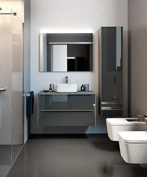
If you are wondering how to incorporate these refreshing bold colours into the bathroom, then consider painting one ascent wall. Yellow and Orange would pair superbly well with Gold and vintage design brassware while Purple and Pink may be chosen with Silver and Chrome bathroom fixtures such as taps and towel rails. Bathroom Furniture partner particularly well with White or Pastel tiles which most homeowners prefer. Alternatively pick tiles in bold colours, designs and prints and match them with soft neutral paint, furnishings and accessories such as curtains and rugs.